mplot3_x(iris$Sepal.Length, type = "density")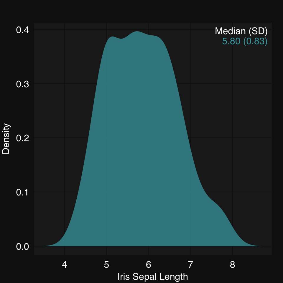
Visualization is a central part of any data analysis pipeline. It is hard to overemphasize the importance of visualizing your data. Ideally, you want to visualize data before and after any / most operations. Depending on the kind and amount of data you are working on, this can range from straightforward to quite challening. Here, we introduce some data visualization functions which are created using base R graphics. Some advantages of using base graphics are:
High-dimensional data can sometimes be indirectly visualized after dimensionality reduction.
mplot3_x(iris$Sepal.Length, type = "density")
mplot3_x(iris$Sepal.Length, type = "hist")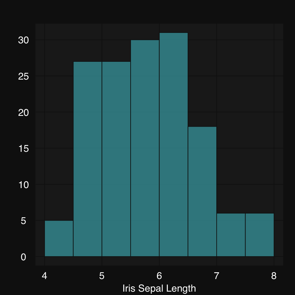
We can also directly plot grouped data by inputing a list. Note that partial matching allows us to just use "d" for type:
set.seed(2019)
xl <- list(A = rnorm(500, mean = 0, sd = 1),
B = rnorm(200, mean = 3, sd = 1.5))mplot3_x(xl, "d")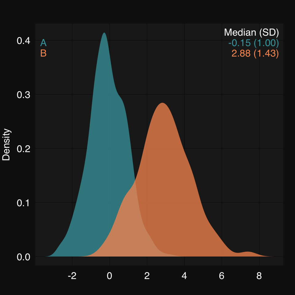
mplot3_x(xl, "hist", hist.breaks = 24)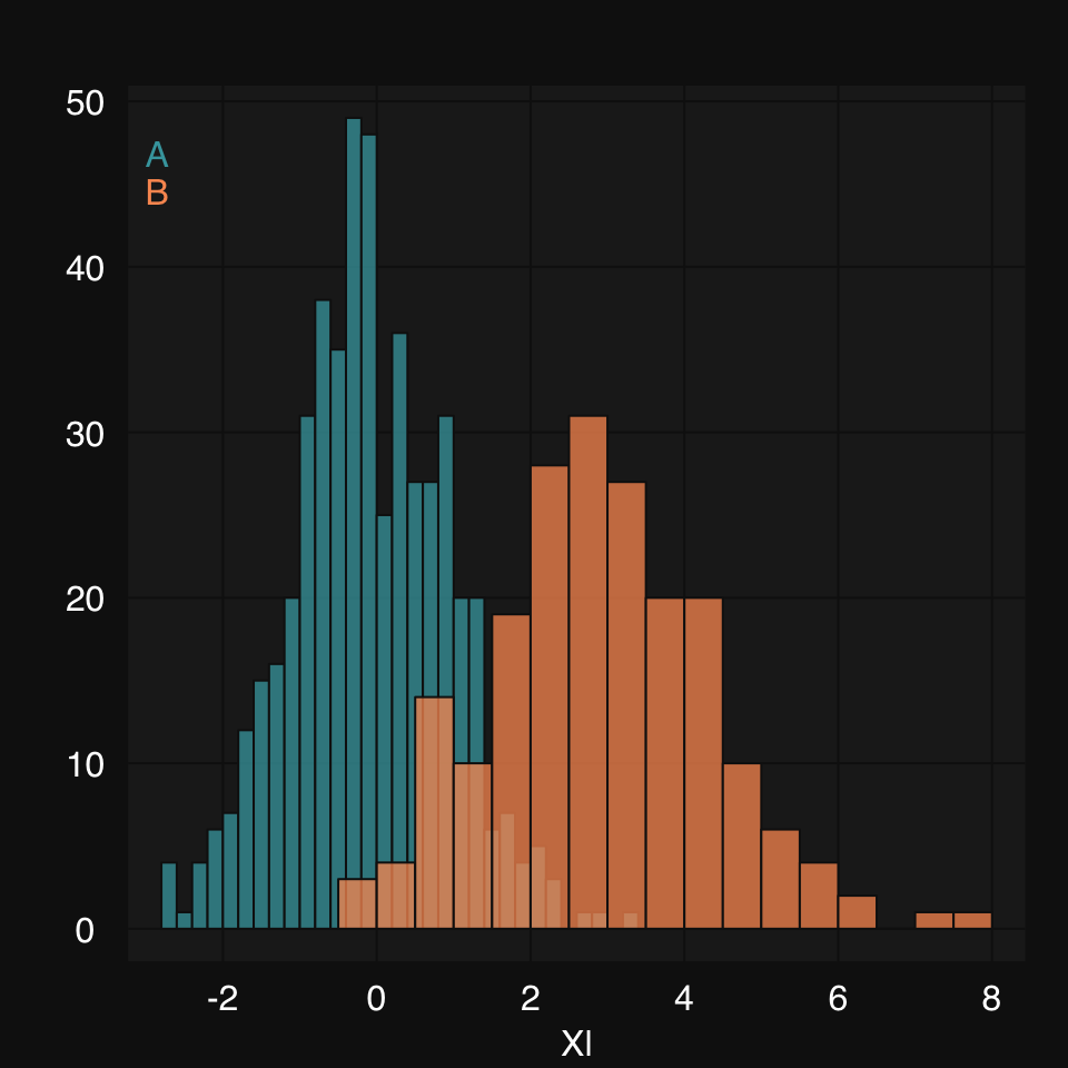
mplot3_x(split(iris$Sepal.Length, iris$Species), "d")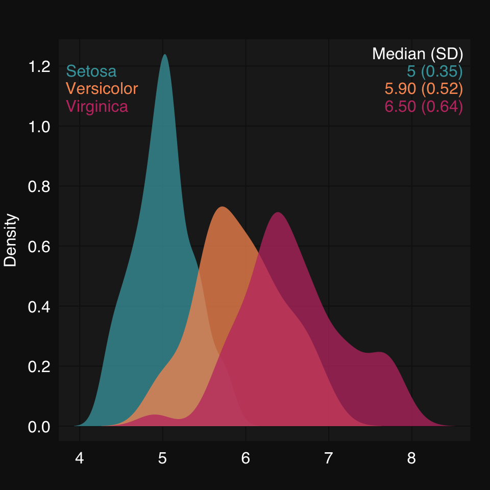
mplot3_x(iris)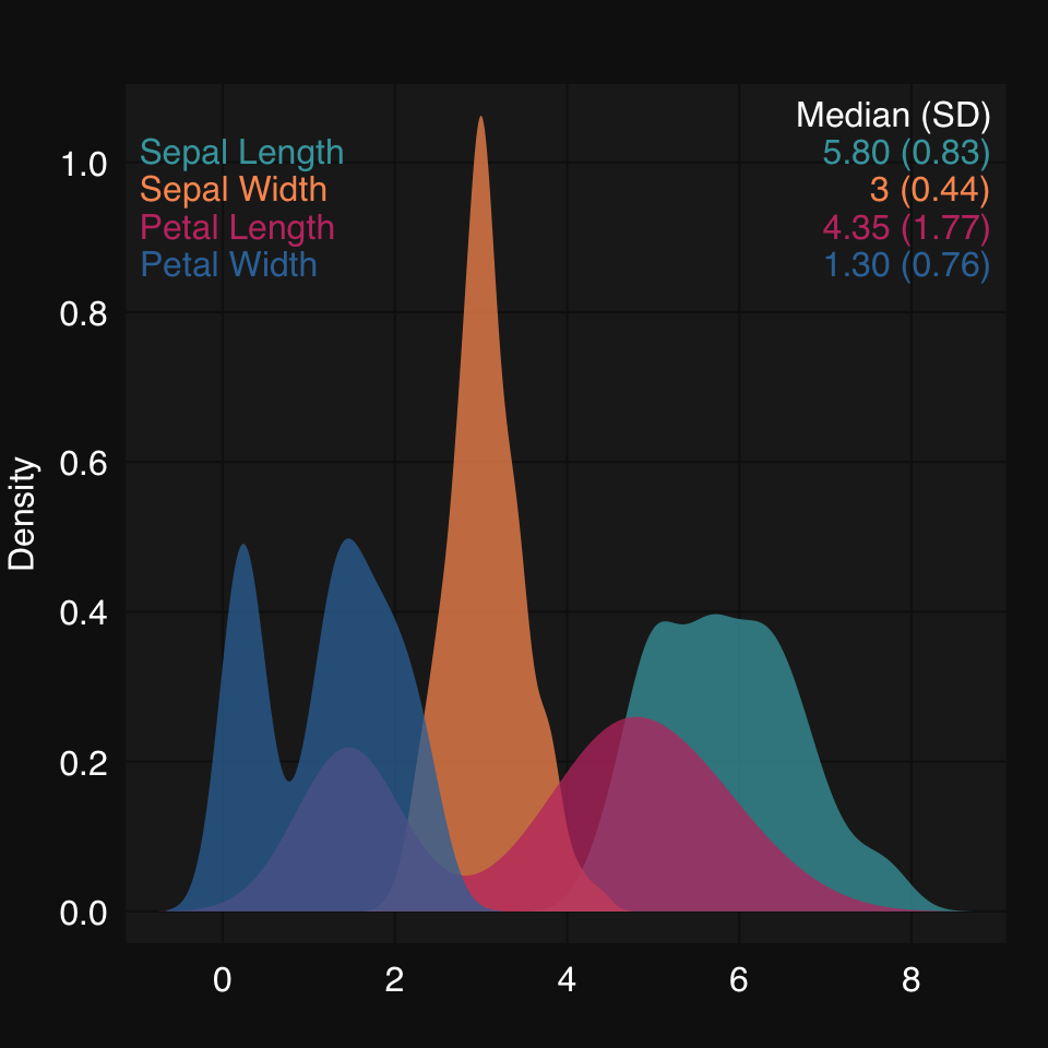
Here we are going to look at the static mplot3_xy() and mplot3_xym(), and the interactive dplot3_xy().
Some synthetic data:
set.seed(2019)
x <- rnorm(200)
y <- x^3 + rnorm(200, 3, 1.5)
We create some synthetic data and plot using mplot3_xy(). We can ask for any supervised learner to be used to fit the data. For linear relationships, that would be glm, for non-linear fits there are many options, but gam is a great one.
mplot3_xy(x, y, fit = 'gam', se.fit = TRUE)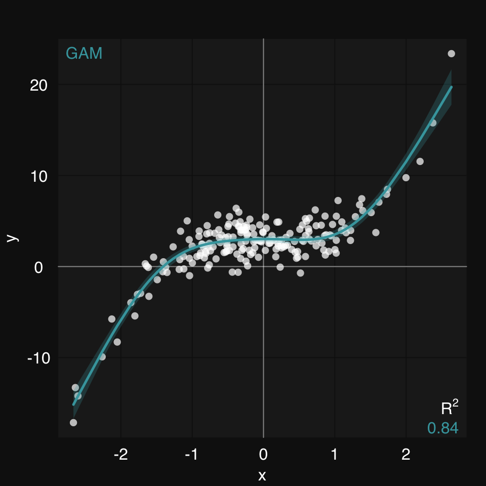
mplot3_xy() allows you to easily group data in a few different ways.
You pass x or y or both as a list of vectors:
set.seed(2019)
x <- rnorm(200)
y1 <- x^2 + rnorm(200)
y2 <- -x^2 + 10 + rnorm(200)/4
mplot3_xy(x, y = list(y1 = y1, y2 = y2), fit = 'gam')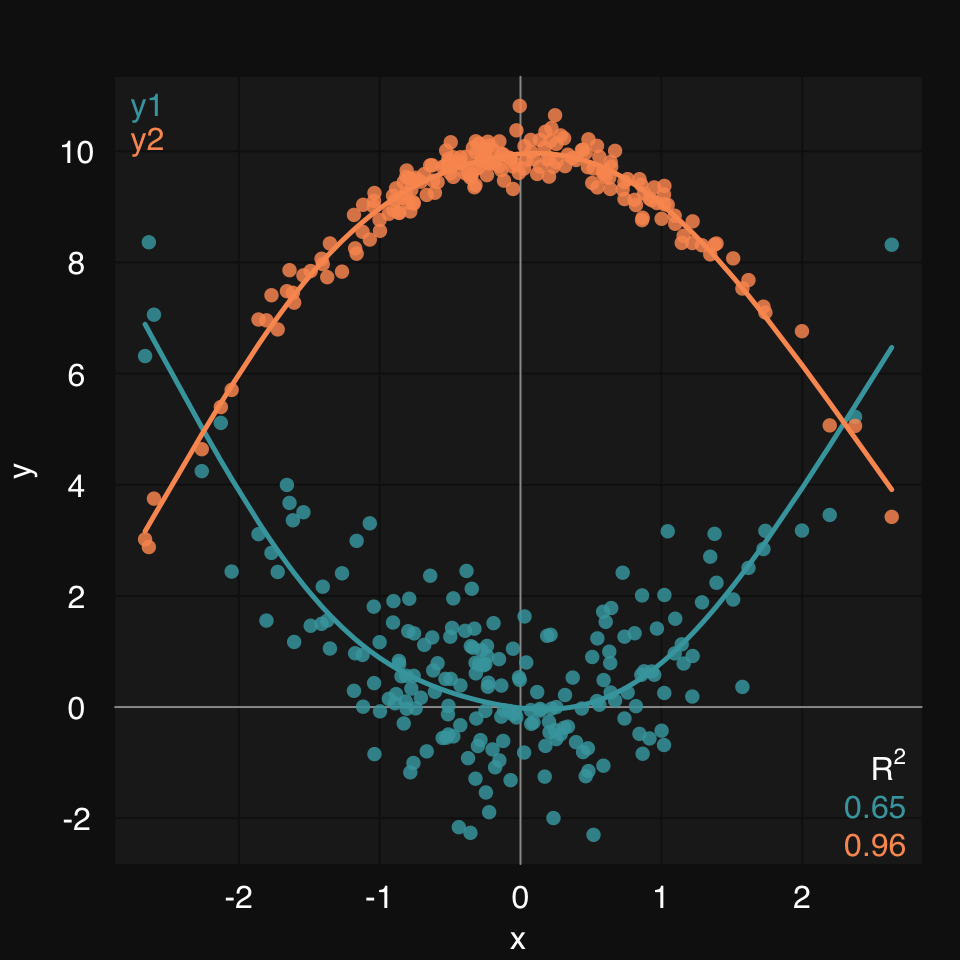
Or you can use the group argument, which will accept either a variable name, if data is defined, or a factor vector:
x <- rnorm(400)
id <- sample(400, 200)
y1 <- x[id]^2 + rnorm(200)
y2 <- x[-id]^3 + rnorm(200)
group <- rep(1, 400)
group[-id] <- 2
y <- rep(0, length(x))
y[id] <- y1
y[-id] <- y2
dat <- data.frame(x, y, group)
mplot3_xy(x, y, data = dat, group = group, fit = "gam")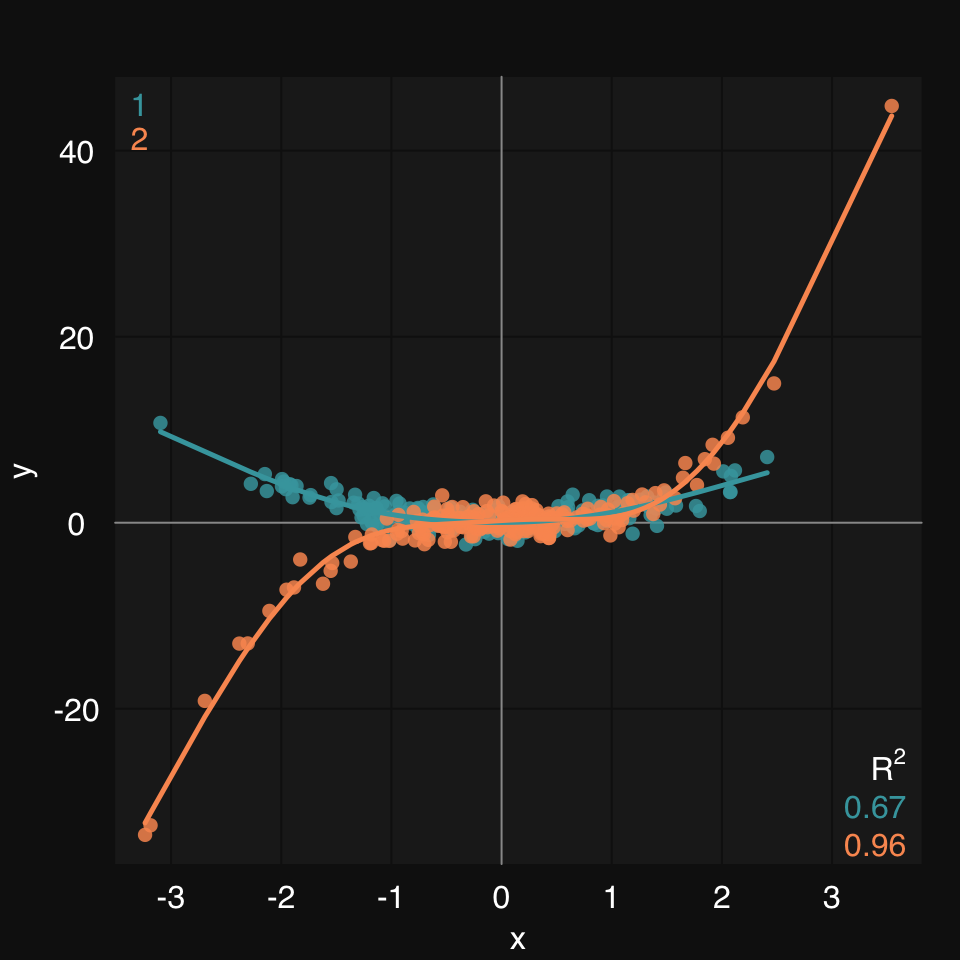
mplot3_xym()This extension of mplot3_xy() adds marginal density / histogram plots to a scatter plot:
set.seed(2019)
x <- rnorm(200)
y <- x^3 + 12 + rnorm(200)
mplot3_xym(x, y)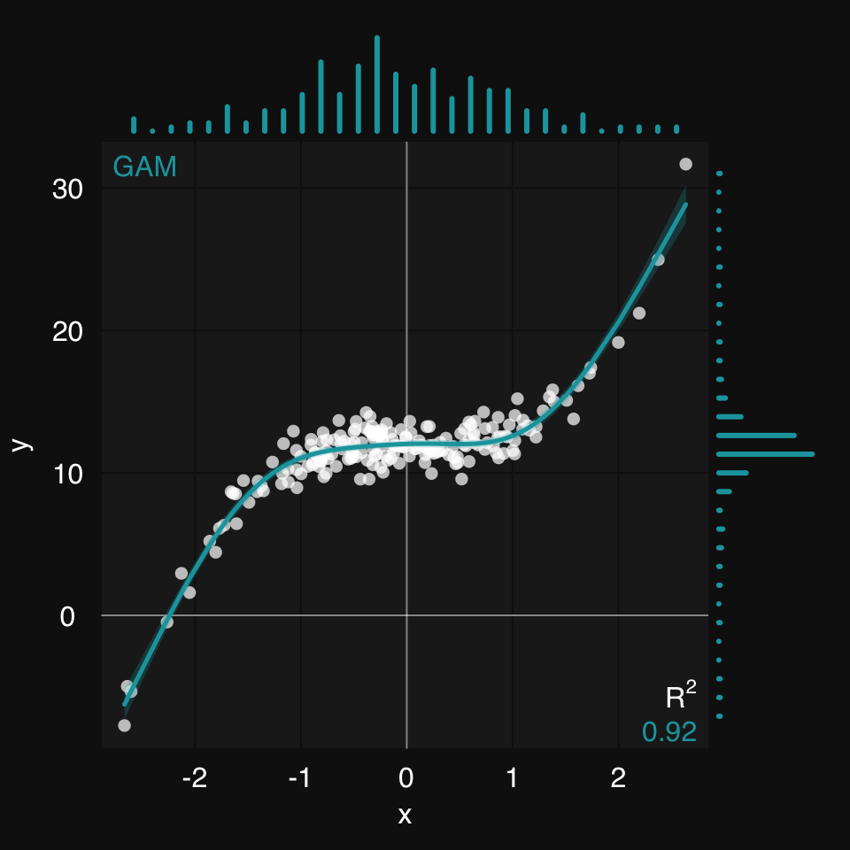
mplot3_xy includes a formula argument as an alternative to fit. This allows the user to define the formula of the fitting function, if that is known. As an example, let’s look at power curves. Power curves can help us model a number of important relationships that occur in nature. Let’s see how we can plot these in rtemis.
First, we create some synthetic data:
set.seed = 8102
x <- rnorm(200)
y.true <- .8 * 2.7 ^ x
y <- y.true + .9 * rnorm(200)
Let’s plot the data:
mplot3_xy(x, y)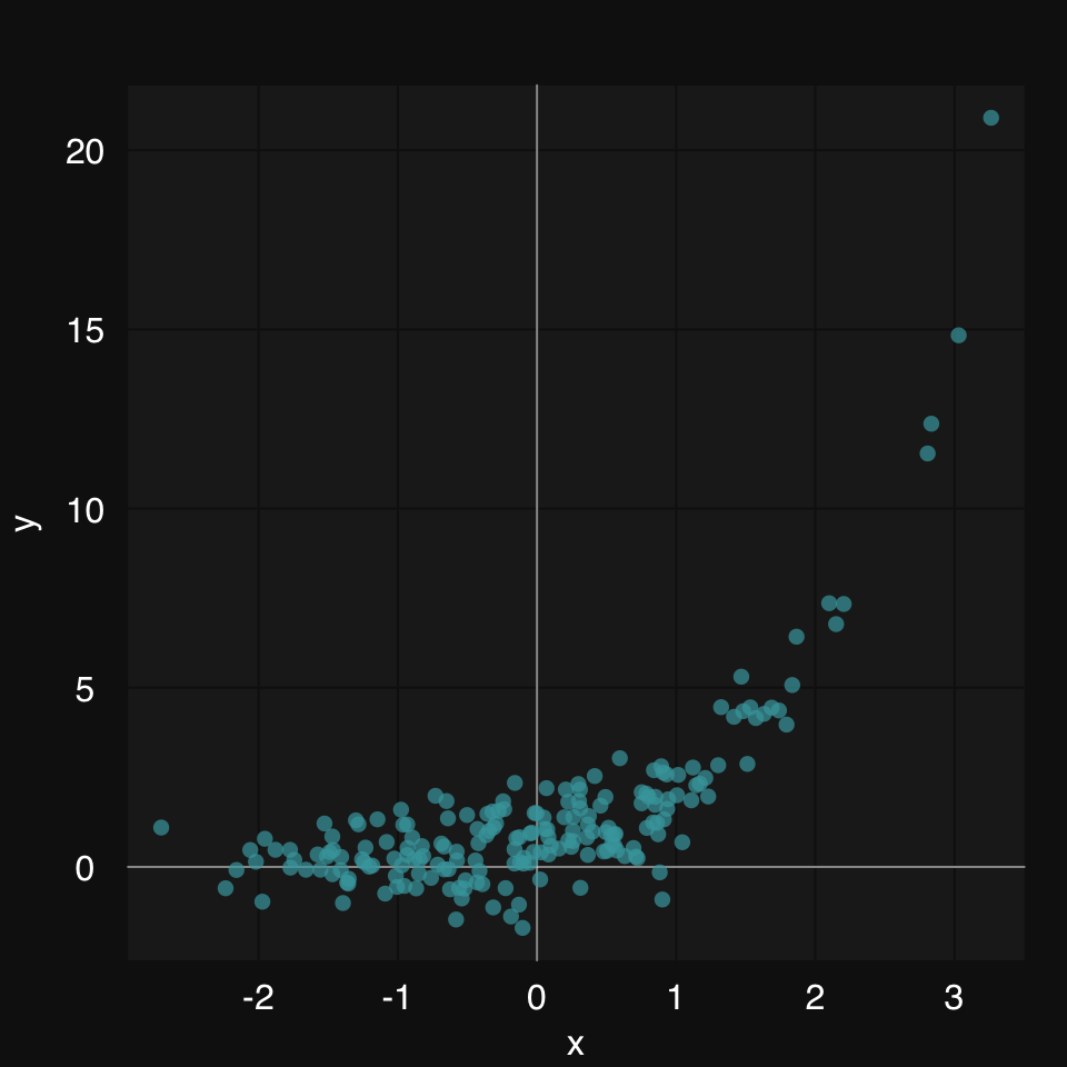
Now, let’s add a fit line. There are two ways to add a fit line in mplot3_xy:
fit argument, e.g. fit = 'glm'formula argument, e.g. formula = y ~ a * x + bIn this case, a linear model (both 'lm' and 'glm' work) is not a good idea:
mplot3_xy(x, y, fit = 'glm')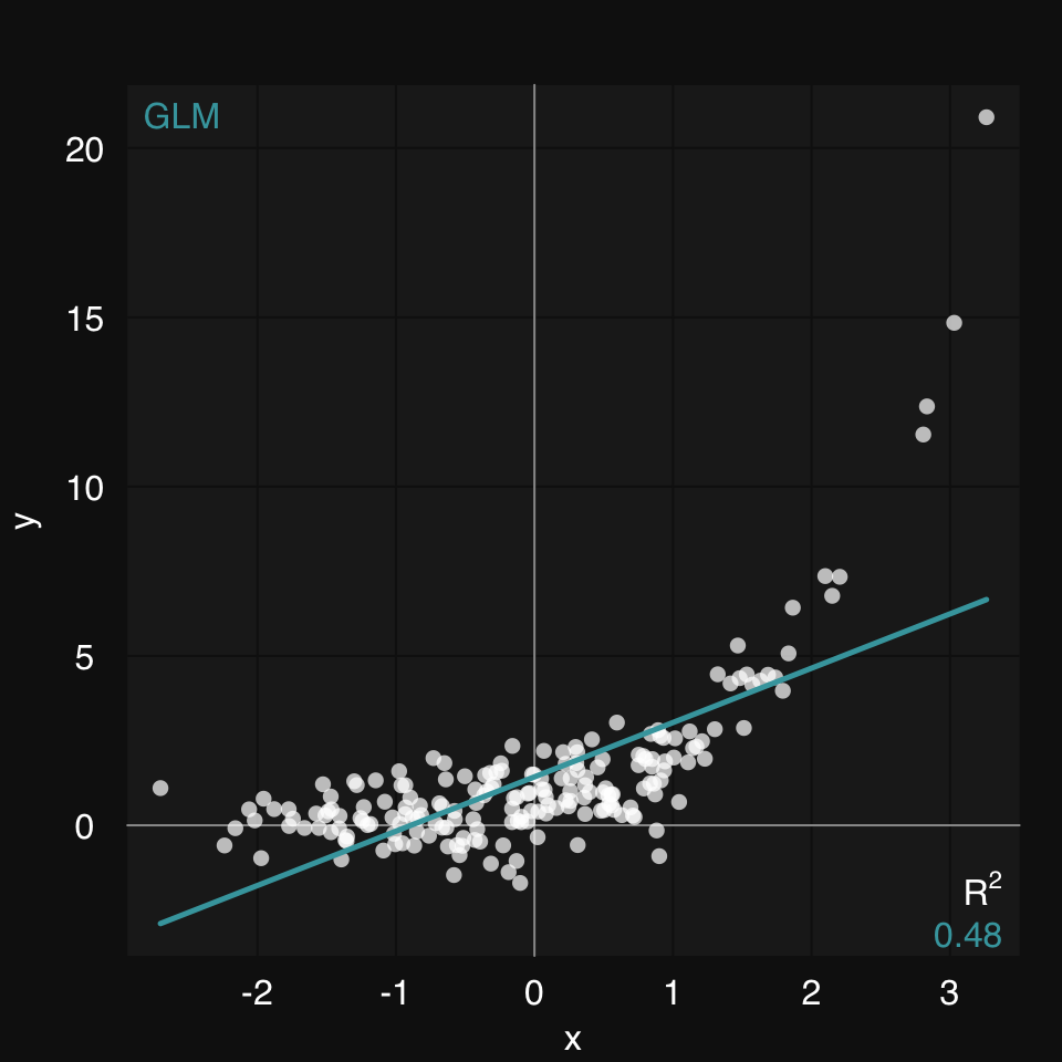
A generalized additive model (GAM) is our best bet if we know nothing about the relationship between x and y. (fit, is the third argument to mplot3_xy, so we can skip naming it)
mplot3_xy(x, y, 'gam')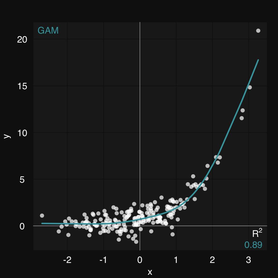
Even better, if we do know the type of relationship between x and y, we can provide a formula. This will be solved using the Nonlinear Least Squares learner (s_NLS)
mplot3_xy(x, y, formula = y ~ b * m ^ x)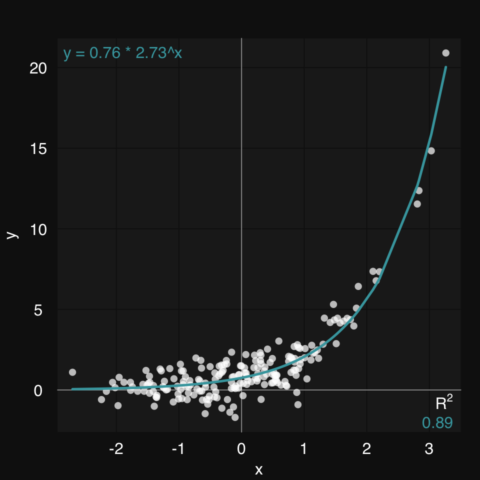
We can plot the true function along with the fit.
fitted <- s_NLS(x, y, formula = y ~ b * m ^ x)$fitted01-07-24 00:23:27 Hello, egenn [s_NLS]
.:Regression Input Summary
Training features: 200 x 1
Training outcome: 200 x 1
Testing features: Not available
Testing outcome: Not available
01-07-24 00:23:27 Initializing all parameters as 0.1 [s_NLS]
01-07-24 00:23:27 Training NLS model... [s_NLS]
.:NLS Regression Training Summary
MSE = 0.68 (89.24%)
RMSE = 0.82 (67.19%)
MAE = 0.65 (54.06%)
r = 0.94 (p = 7.9e-98)
R sq = 0.89
01-07-24 00:23:27 Completed in 1.5e-04 minutes (Real: 0.01; User: 0.01; System: 1e-03) [s_NLS]
mplot3_xy(x, y = list(Observed = y, True = y.true, Fitted = fitted),
          type = c('p', 'l', 'l'), marker.alpha = .85)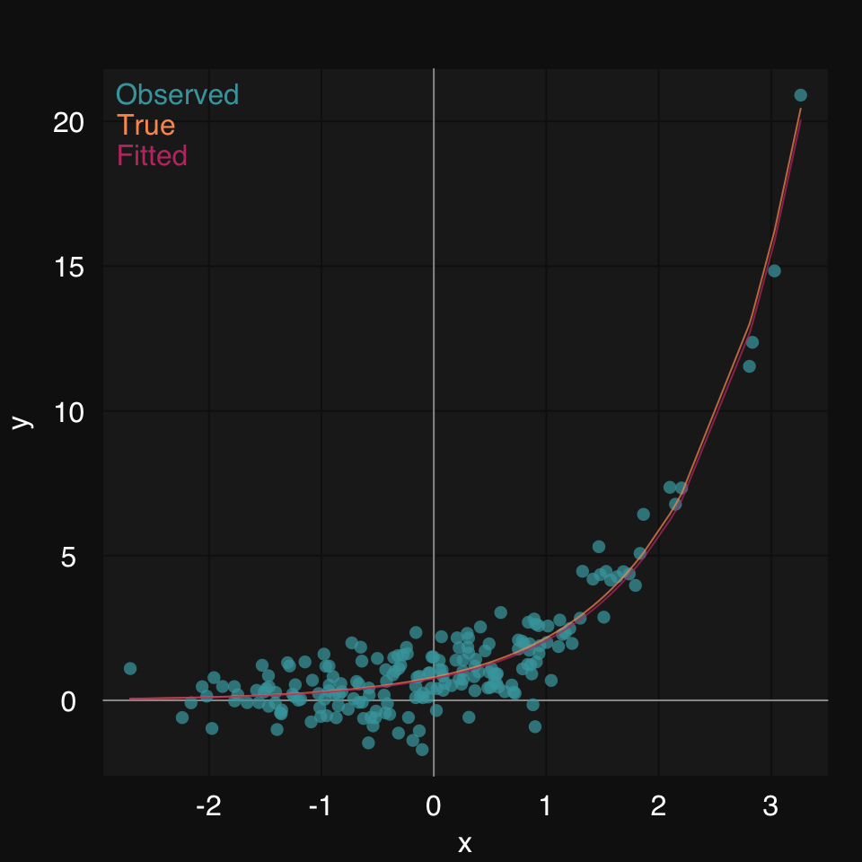
We already saw we can use any learner to draw a fit line in a scatter plot. You can similarly use any clutering algorithm to cluster the data and color them by cluster membership. Let’s use HOPACH (Van der Laan and Pollard 2003) to cluster the famous iris dataset. Learn more about [Clustering].
mplot3_xy(iris$Sepal.Length, iris$Petal.Length,
          cluster = "hopach")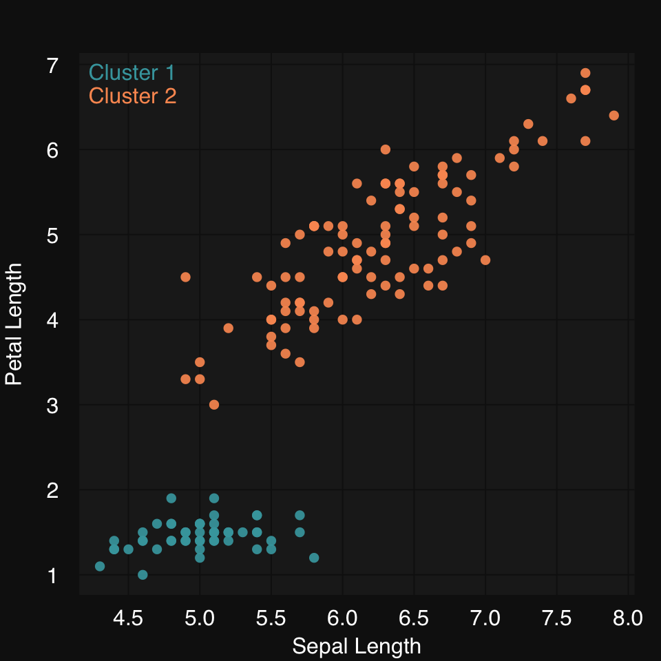
x <- rnormmat(20, 20, seed = 2018)
x.cor <- cor(x)mplot3_heatmap(x.cor)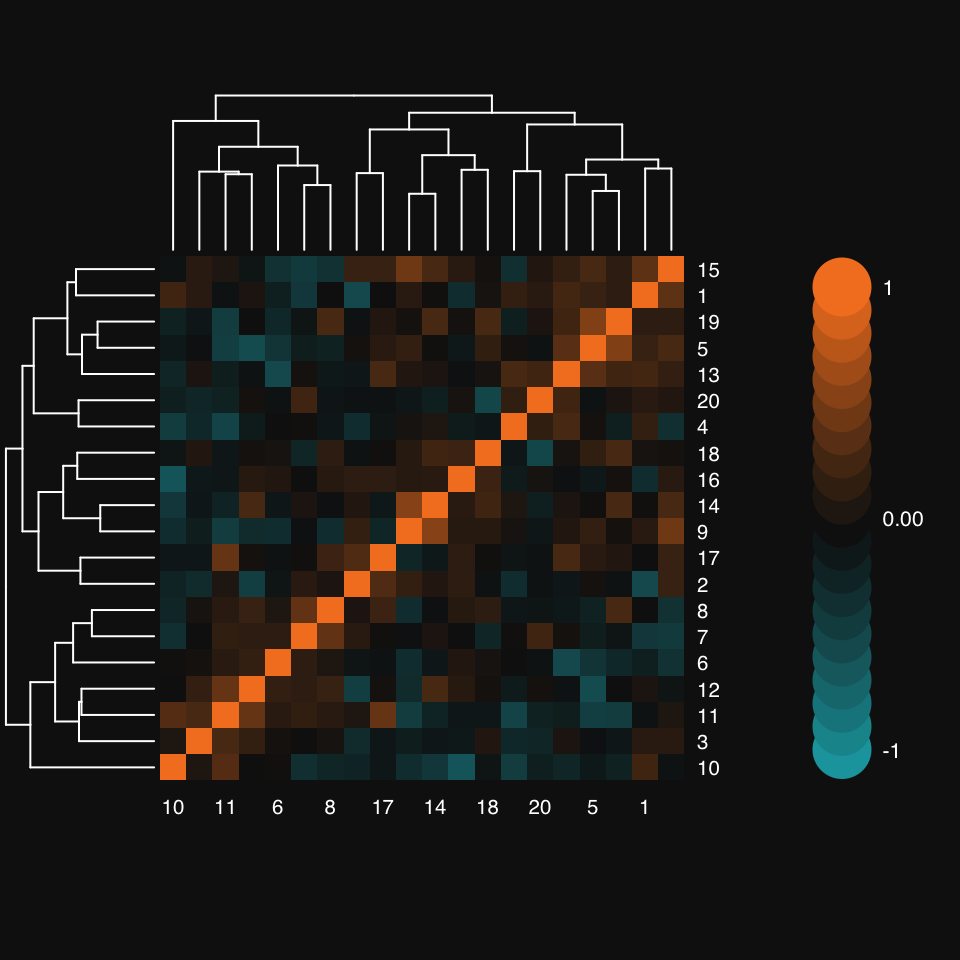
Notice how mplot3_heatmap’s colorbar defaults to 10 overlapping discs on either side of zero, representing a 10% change from one to the next.
Turn off hierarchical clustering and dendrogram:
mplot3_heatmap(x.cor, Colv = NA, Rowv = NA)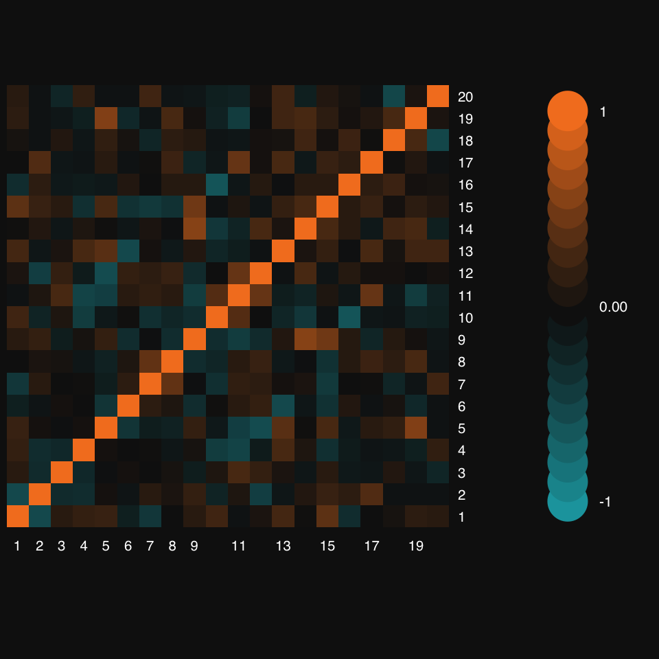
mplot3_bar(VADeaths,
           col = colorRampPalette(c("#82afd3", "#000f3a"))(nrow(VADeaths)),
           group.names = rownames(VADeaths),
           group.legend = TRUE)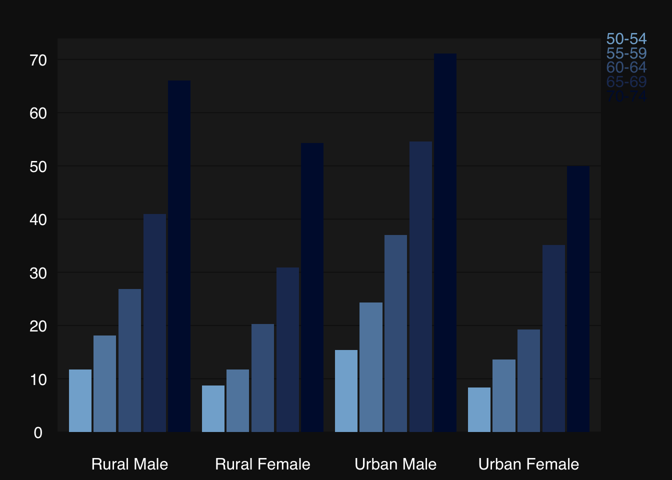
Some synthetic data:
x <- rnormmat(200, 4, return.df = TRUE, seed = 2019)
colnames(x) <- c("mango", "banana", "tangerine", "sugar")mplot3_box(x)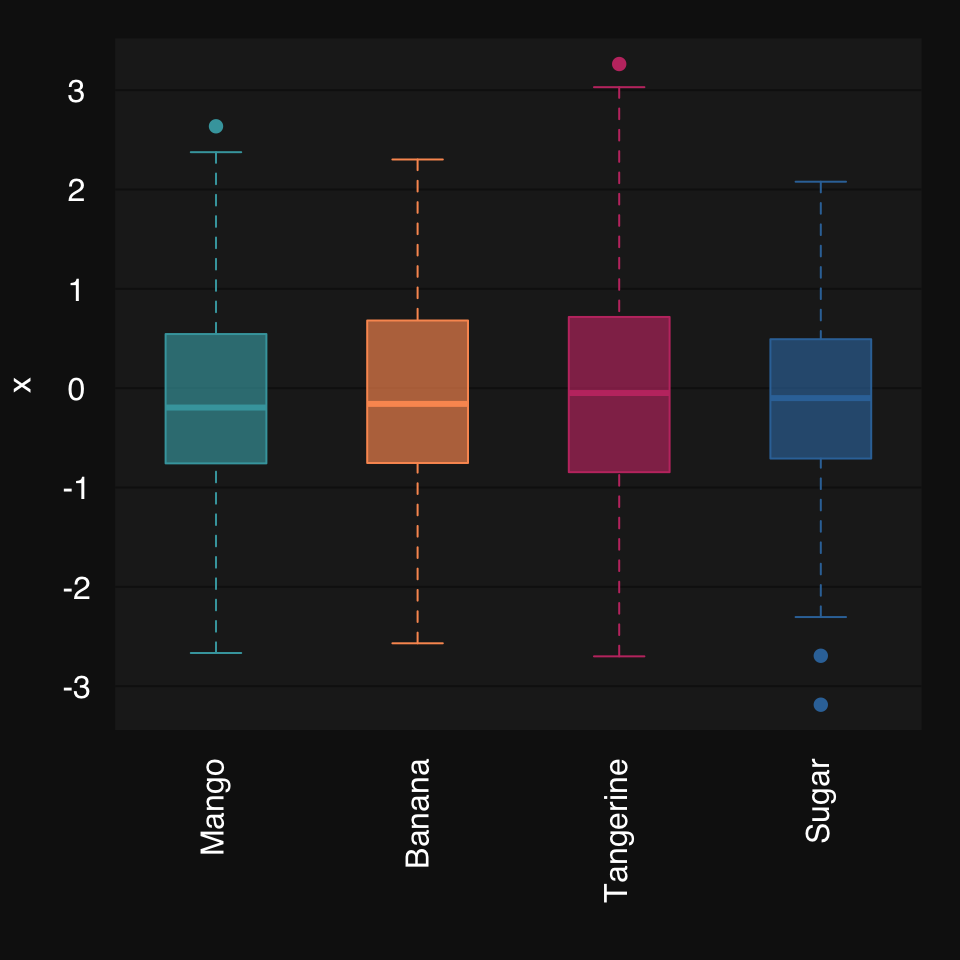
Mosaic plots are a great way to visualize count data, e.g. from a contingency table.
Some synthetic data from R’s documentation:
party <- as.table(rbind(c(762, 327, 468), c(484, 239, 477)))
dimnames(party) <- list(gender = c("F", "M"),
party = c("Democrat","Independent", "Republican"))mplot3_mosaic(party)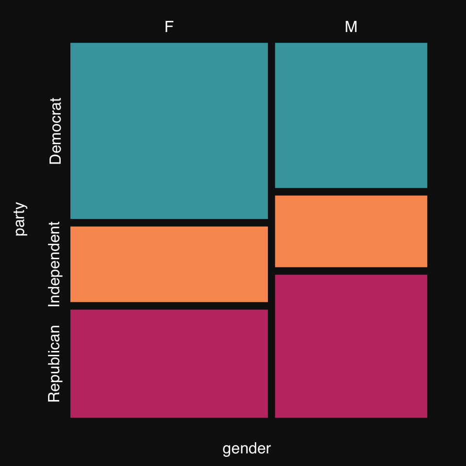
The goal of a classifier is to establish a decision boundary in feature space separating the different outcome classes. While most feature spaces are high dimensional and cannot be directly visualized, it is can still be helpful to look at decision boundaries in low-dimensional problems. We can compare different algorithms or the effects of hyperparameter tuning for a given algorithm.
Let’s create some 2D synthetic data using the mlbench package, and plot them, coloring by group, using mplot3_xy.
set.seed(2018)
data2D <- mlbench::mlbench.2dnormals(200)
dat <- data.frame(data2D$x, y = data2D$classes)
mplot3_xy(dat$X1, dat$X2, group = dat$y, marker.col = c("#18A3AC", "#F48024"))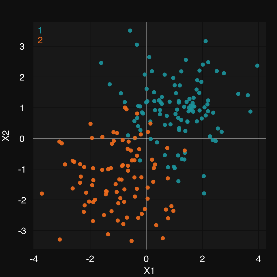
mod.glm <- s_GLM(dat, verbose = FALSE, print.plot = FALSE)Warning in eval(family$initialize): non-integer #successes in a binomial glm!mplot3_decision(mod.glm, dat)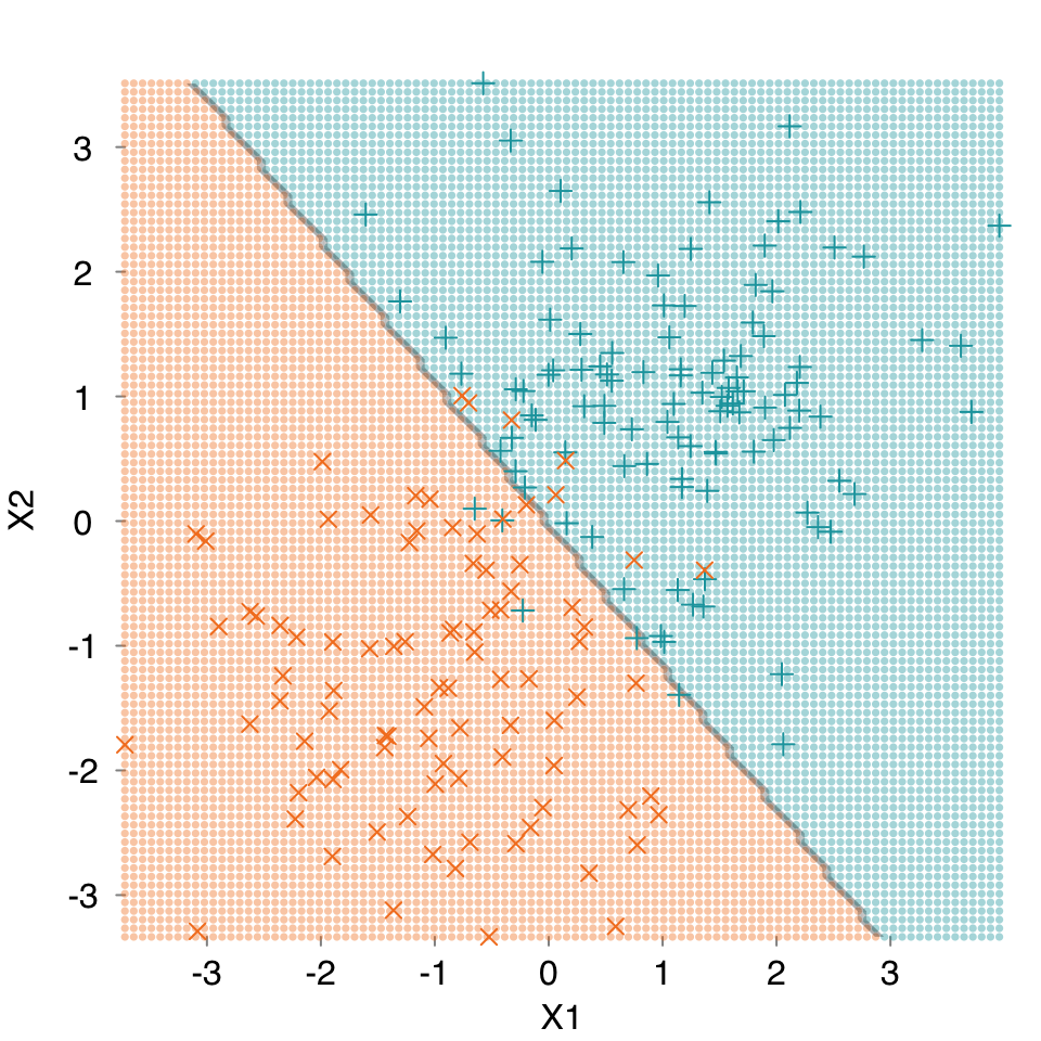
mod.cart <- s_CART(dat, verbose = FALSE, print.plot = FALSE)
mplot3_decision(mod.cart, dat)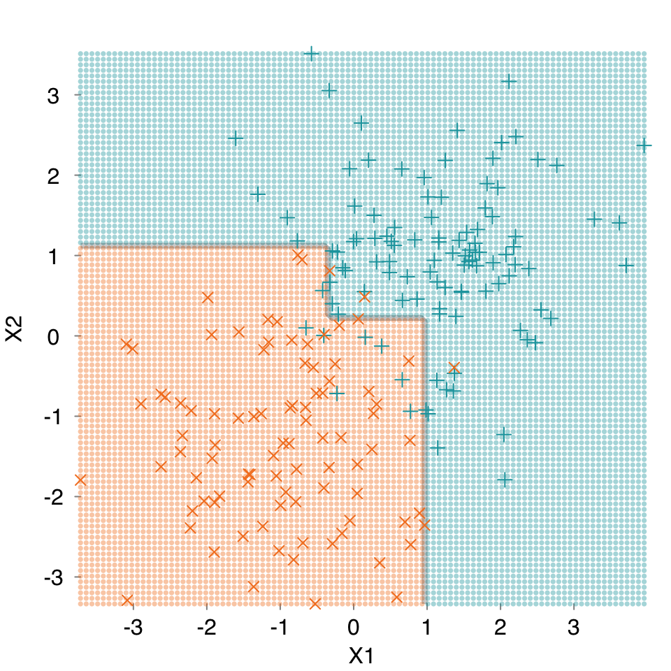
mod.rf <- s_Ranger(dat, verbose = FALSE, print.plot = FALSE)
mplot3_decision(mod.rf, dat)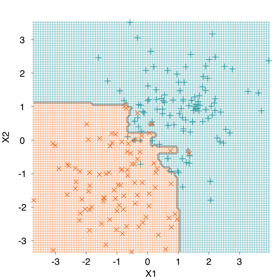
rtemis provides a convenience function to plot multiple graphs together, rtlayout. It’s based on the graphics::layout function and integrates behind the scenes with all mplot3 functions. You specify number of rows and number of columns. Optional arguments allow you to arrange plots by row or by column and automatically create labels for each plot. As with most visualization functions in rtemis, there is an option to save to PDF. This means you can create a publication-quality multipanel plot in a few lines of code:
Start by defining n nrows and n columns, plot your plots using mplot3 functions, and close using rtlayout().
set.seed(2019)
x <- runif(200, min = -20, max = 20)
z <- rnorm(200, mean = 0, sd = 4)
y <- .8 * x^2 + .6 * z^3 + rnorm(200)
rtlayout(2, 2, byrow = TRUE, autolabel = TRUE)
mplot3_x(x, 'd')
mplot3_x(z, 'd')
mplot3_xy(x, y, fit = 'gam')
mplot3_xy(z, y, fit = 'gam')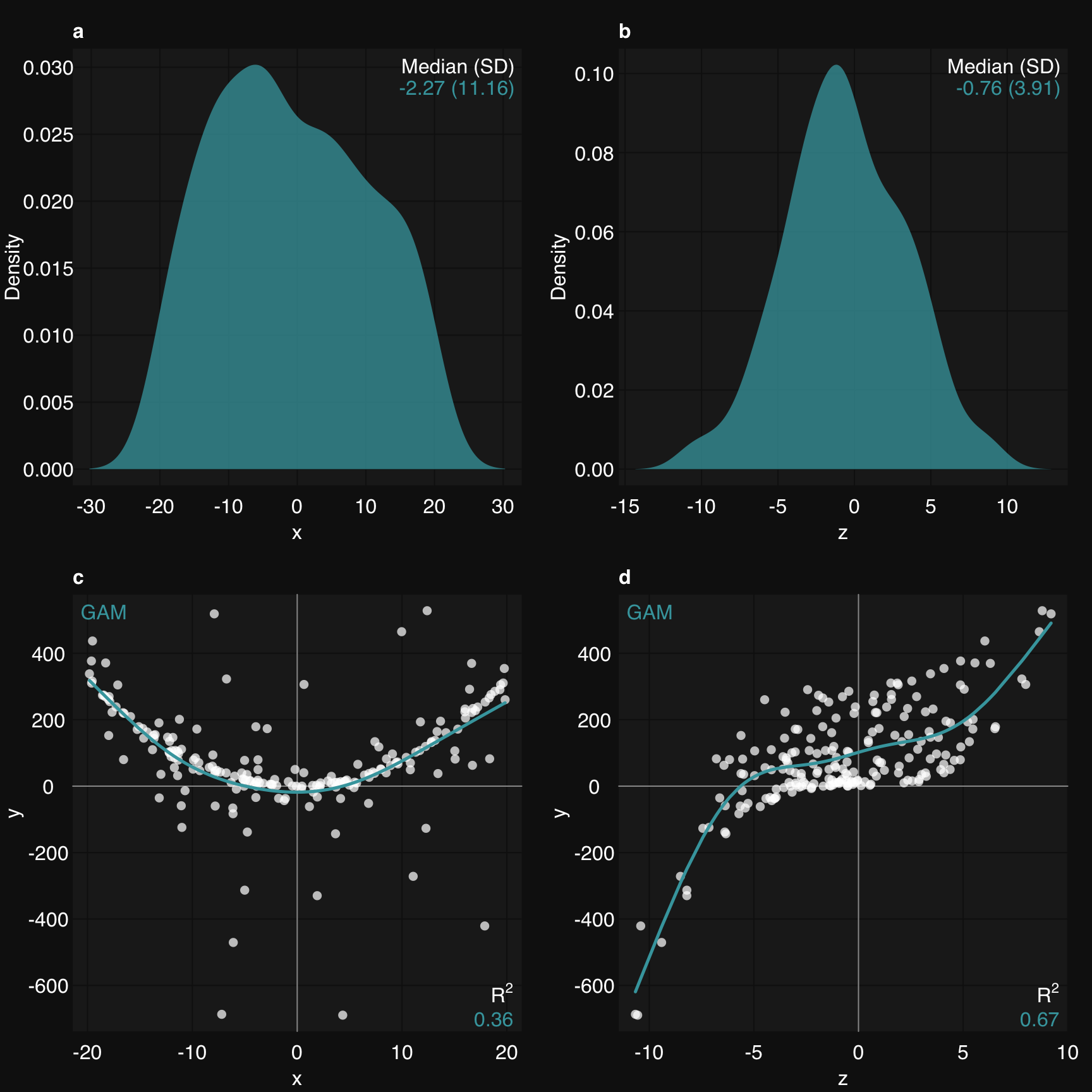
rtlayout()